- 16 min read
Flexbox adds a level of control to our layouts that we didn't really have before, we hacked our floats and clearfixed, we fought whitespace with inline-block, pushed display:table, and even stretched content with position:absolute. We no longer need to rely on these solutions beyond providing something visual to browsers without flex features. Flex's features will add an important set of tools to how we build, not by replacing what was there before, but improving upon how we build today.
The major challenge that I see with Flexbox is that there's a distinct gap between what we build today and how we'll approach tomorrow. The prevailing attitude seems to be “Not for another x years”, or “we'll wait for X browser to catch up”, but we don't need to think like this anymore.
I don't blame people for finding Flexbox difficult to grasp. Most of the tutorials that exist on the web either show you a bunch of boxes that are completely abstract, or jump so far ahead that the only logical thing to do with Flexbox is to work backward from these magically simple layouts, and end up in a mountain of unmaintainable code. My own previous article was the former, I wrote it to understand Flexbox.
These tutorials exist for a purpose, either they're trying to show you what the properties are and what they do, or they're trying to excite you about future possibilities. Both of which I believe they succeed at doing, but there's still a gap - we need a logical, pragmatic approach to start using Flexbox today.
TLDR; version
I recognize this experiment write up is super long, so here's a shortcut if you don't have much time:
Road to Flexbox
In this experiment, I'm attempting to show the value of Flexbox in today's layouts, outline a strategy for adding it and give a few examples of how Flexbox can give current layouts extra powers that we either couldn't achieve, or were difficult to achieve before. I'll also be documenting some of the common mistakes that I've made while trying to implement it as I believe being able to troubleshoot any new technology's problems is sometimes one of the harder things in picking up something new. My aim is that more people start using Flexbox so that we can push its limits, and get any bugs ironed out, sooner rather than later.
If you're not already familiar with Flexbox, this is a follow up of my previous experiment Flexbox adventures, where I tried to tackle and understand how it actually calculates space and how it might be used in the future. It's full of helpful links that'll bring you up to speed on Flexbox.
Making layouts better
Flexbox's properties involve a whole array of control over alignment and ordering, and once you get used to how it works, it starts to become clear how little CSS you actually have to write to augment how we're building things today.
Do I believe we'll completely drop floats, inline block, or display table? No, and I think educators should still teach students these things even if they do get eventually phased out, it's important to know that sometimes with CSS, we bend, and that's where interesting discoveries are made.
Here are some examples of layouts that I believe we can improve quite easily by adding Flexbox.
Card Layouts
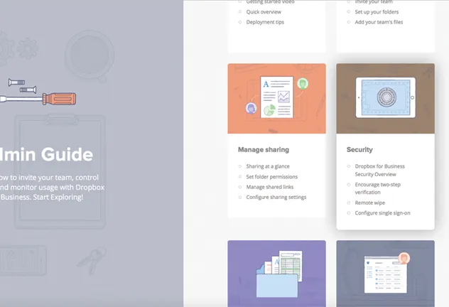
The card layout is pretty popular, but in order to get equal height columns you have to set minimum heights, or split lists up into rows. If you don't split them into rows, you have to clear after every row. Flexbox gives us the ability to solve these problems with ease.
Split screen layouts
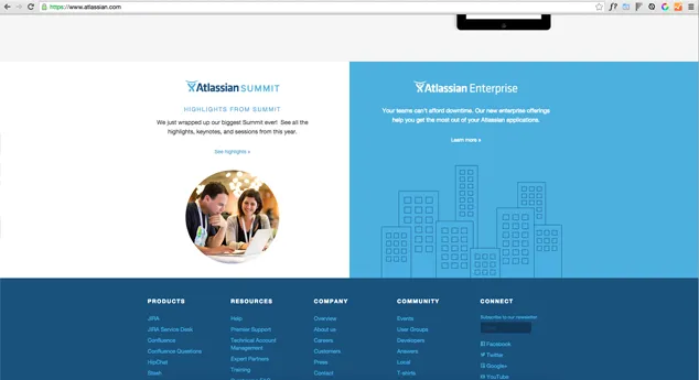
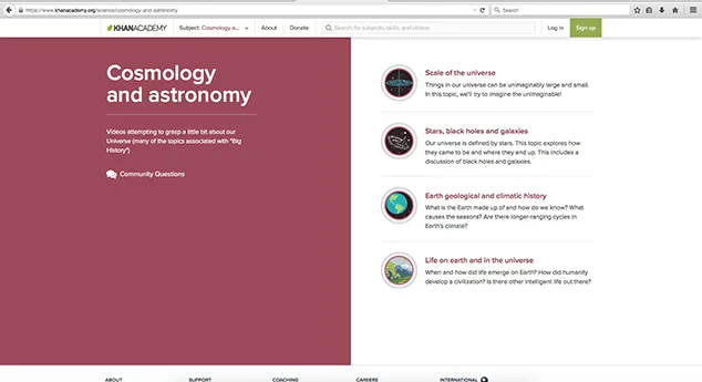
One of the difficulties with split screen is it's reliance on minimum height or position:absolute stretching, making it a pain when moving across screen sizes. Flexbox can just give each item equal height, and then provide you with options for vertical centering with ease.
Pinned Layouts
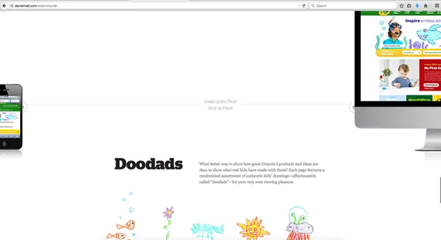
Using the space-between property this layout can be achieved with Flexbox, and give options for ordering and alignment.
Newspaper and ad units
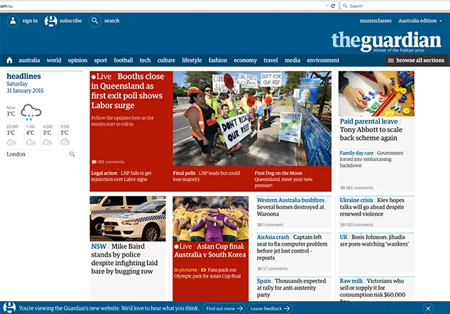
The benefit to newspaper layouts and ad units is the ability to order and align. This is just a conceptual idea, and maybe it's stupid in practice - but imagine a system that detects that you don't ever read the sport section - well it can reorder sport toward the bottom of the page and maybe push world news toward the top. Being able to reorder sections could add simple reader preference reorganization. This is made incredibly simple with Flexbox.
Multi-column layouts
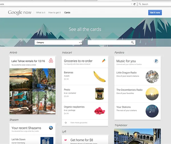
If like me, you thought CSS columns would give you this, and then gave you nothing but broken content blocks - this is one way we can split up a list over multiple columns without having to split up the list in markup.
Dashboards
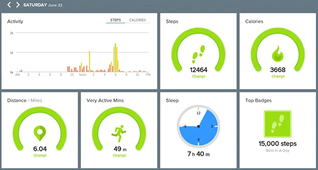
Dashboards offer us another case for ordering, but also could benefit from column wrapping, or equal height columns.
Embracing change
Flexbox aims to solve layout problems that we've hacked to achieve, it allows us to embrace the variable nature of both content and design. It also allows us to accomodate design requests which seem simple to someone who doesn't build, but results in either way too much time, us writing completely unsemantic markup, or way too much code to seem worthwhile. In the future, we'll have more tools like CSS Grid, but for now Flexbox is ready and waiting to be used right now, and we no longer have to bash every layout with the rusty old hammer we've been using for 13+ years.
Content is flexible
Content is inherently flexible, in the past we’ve designed, built and approached fitting the content to the design rather than fitting the design and build to the content. Even today, we impose restrictions based on build constraints, when we should be relying on the content strategists to impose these restrictions, not the developers.
We don't always have control
Content management systems are a prime example of where we cede control on layout flexibility - we are often designing with limited knowledge of what content will be within a space. We can achieve things by all kinds of hackery, or we can impose certain rules - but we lose that flexibility when we do. Some of our approaches to achieving things visually cause us to abandon markup that makes sense and when we stop building in way that makes sense we have to work really hard to make them accessible.
More design tools
Design often informs what we build and how we build, but so do the tools and constraints of development inform the capabilities of what can be designed. Ideally, a more mature understanding of Flexbox will have us creating better quality, and more varied designs.
Bend and break
It's not until we fully understand something that we can start to bend it beyond its original purpose to achieve something greater, how we break it influences how we make it.
Today, we know the basic rules of Flexbox and what that can do to today's layouts, with education we can influence entirely new layouts, and it won't be until we see Flexbox used in combination with some of the other lesser used, or newer features that we will really start to see the possibilities appear.
Strategy for Flexbox
To make Flexbox easier to adopt, I decided to look at some of the key criteria in which would make it easy to do so.
Build the way we always did
We should be able to look at just about any project that we’ve done in the past year and add a piece of code and reap the benefits of Flexbox. We should be able to build a new project tomorrow the way we always did, then add some code that will make Flexbox work and make layouts better.
Using a library like Modernizr we can put the new flexbox code behind .flexbox, and optionally put any layout specific to floats (float:left, width:33% etc) behind .no-flexbox so that we can one day phase it out.
Minimize code
Managing 3 syntaxes plus float layouts just to enable Flexbox is madness. Using an autoprefixer is an integral part of the Flexbox adoption strategy.
Make it worthwhile
We need our layouts to benefit from Flexbox otherwise we're throwing unnecessary code at a layout for the sake of it. The obvious ones of these involve vertical centering, columns matching their ends, and ordering.
Cut the mustard: Flex-wrap
Flex-wrap is the point at which Flexbox often becomes useful, it's not necessary for all of these enhancements, but it's the point at which I choose to enhance Flexbox from to prevent layout issues. Fortunately, the Modernizr library's ‘.flexbox’ has flex-wrap as part of its detection, so if you use .flexbox you'll be cutting out browsers which don't support flex-wrap.
I've seen talk of people using @supports here, but that cuts out way too many browsers, either write your own feature detection or just use Modernizr.
Enhancing with Flexbox
To better explain how easy it is to modify existing layouts to flexbox here are two experimental layout enhancements - one with the Card Pattern and one with the Split screen pattern.
Example 1: Card layout with list
-

-

Second
I'm a card
I'm some extra content put here to make life more difficult, because I can.
Button -

-

Fourth
Dreamcatcher PBR iPhone seitan viral, DIY Truffaut biodiesel slow-carb. Health goth twee migas, messenger bag irony tilde chillwave cold-pressed listicle bespoke Schlitz readymade.
Button -

Fifth
Shabby chic put a bird on it normcore, irony Shoreditch street art hella post-ironic 3 wolf moon fashion axe flexitarian semiotics tote bag.
Button
How flexbox makes it better
We've had a way to layout something like this using floats, but every item is going to appear a different height, so you have to impose a minimum or fixed height to every item to achieve equal height columns, and having the button anchor to the bottom you'd have to make it position absolute, and then pad out the card at the bottom.
Once you've done all this, all you have to do is change your screen width to something more narrow where you need the collapse to happen to feel the pain of the monster you've just created. Lots of changing min-heights or your fixed height, and all someone needs to do is add a bit more content than you designed for and you're in a world of hurt.
Flexbox solves this, we build the layout how we would have without setting those restrictions (so the columns aren't equal height), add Flexbox and we get all the alignment goodness in just about every modern browser.
Step 1: Markup structure
I look at this pattern as an unordered list of cards, a card is its own module that lives within a list item.
Inside that card are several items of content (image, heading, paragraphs, button). By personal preference of how I might like to stretch the content horizontally on different screens I seperate the content from the image so they can live side by side on float layouts.
As I mentioned previously, I'm building how I would've built without Flexbox, it shouldn't really affect my markup structure.
<!-- card list -->
<ul class="flex-card-list">
<!-- card list item -->
<li class="flex-card-listitem">
<!-- card module -->
<div class="flex-card">
<!-- image container -->
<div class="flex-card-image">
    <img src="/img/placeholder.jpg" />
</div>
<!-- content container -->
<div class="flex-card-content">
    <h3 class="flex-card-heading">First</h3>
    <p>I'm a card and I'm first.</p>
    <a href="#" class="flex-card-button">Button</a>
</div>
</div>
</li>
</ul>
Step 2: Styling the list
On the unordered list we add display:flex, any time we use display:flex we're saying we want to do something with the child elements of that element, in this case our aim is to get the list items to be the same height. Flex will by default stretch items vertically, and lay out on a row. Stretching the list items is the first step to getting the nested items to stretch to the same size.
Our list of cards is going to exist on more than one line/row, so we need to use flex-wrap to tell the items to wrap to the next line when they hit the edge of the container.
/* Put behind .flexbox for Feature detection with Modernizr */

.flexbox .flex-card-list {

display:flex;
flex-wrap:wrap;

}
Step 3: Styling the list items
We add display:flex to the list items because we want the card modules to be controllable with flexbox.
.flexbox .flex-card-listitem {

display:flex;

}
Step 4: Media queries
At this point, we add media queries for different screen widths. My layout will go three cards per row, two cards per row, then one card per row.
/* Code to adjust the layout to 2 cards per row */
@media all and (min-width:40em) {

/* Float layout */
.flex-card-list li {
width:50%;
}
.no-flexbox .flex-card-list li {
float:left;

}

}
/* Code to adjust the layout to 3 cards per row */
@media all and (min-width:40em) and (max-width:60em) {

/* Clears the row for 2 item per row layout */
.no-flexbox .flex-card-list li:nth-child(2n+1) {
clear:both;
}
}
@media all and (min-width:60em) {

/* common to flex and non-flex */
.flex-card-list li {
width:33.33%;
}

/* Float specific: Clear after every third item */
.no-flexbox .flex-card-list li:nth-child(3n+1) {
clear:both;
}


}
Step 5: The card module
We now have a list of objects that change their layout based on media queries, and each item is stretching to the height of the list items. Equal height columns are here, but our buttons are anchored to the paragraph, not to the bottom of the card modules. By adding display flex to the card module we can now use flex to control the image and the content block. We'll also add flex-direction column, since we want to treat it as a full height column.
.flexbox .flex-card {

display:flex;
flex-direction:column;

}
Step 6: The card content
We need to put display:flex on one more item, the card content div, this is so we can control its elements, set its direction to column to let it know we want to use a tube of content and add flex:1 0 auto (thw grow is the important part) to it to let it know to grow to fill the remaining space left behind.
.flexbox .flex-card-content {

display:flex;
flex:1 0 auto; /* We have to add a basis for IE10/11 */
flex-direction:column;

}
Step 7: Flexible paragraphs
It's up to you what you choose to make flexible within the content block, I would use the most variable item, the paragraphs, to grow to fill (add flex:1 0 auto). This will now stretch the bottom of the paragraph and pin the button to the bottom of the card.
.flexbox .flex-card-content p {

flex:1 0 auto; /* We have to add a basis for IE10/11 */

}
Example 2: Split Layout

Finn the human
Finn (full title: Finn the Human, or Finn Mertens, and formerly known as Pen in the original short), is the main protagonist of the series Adventure Time.
Learn more
Jake the dog
Jake (full title: Jake the Dog), the deuteragonist of Adventure Time, is a magical dog and Finn's constant companion, best friend, and adoptive brother.
Learn MoreHow flexbox makes it better
There are a number of approaches one could take to make the split screen layout work - once again we could rely upon a grid row, we could give a minimum height to both items, or we could use the position absolute approach and hook the items to their respective directions (left:0, bottom:0, top:0 etc). Or we could just say be 100vh high, and 50vw wide and ignore how much content there is and throw another div around that content and try to center position that div within its box.
The problem to all of these approaches is that we need to dictate a height at some point. Like the previous layout problem - setting minimum heights is problematic across screen sizes (although not such a problem when your layout becomes single column).
Adding flexbox solves this and gives us some tools to align all of the content within the container, while allowing the content to dictate the size of the container. You can align it vertically or horizontally any way you like - including the centering it vertically.
If we wanted to reorder the children, we can do that too without having to move the items in the DOM.
Note: Keyboard control can be an issue when you go down the order path, so i’d say do it sparingly, and probably for larger items that don’t create too much of a jarring experience rather than on smaller items that need lots of tab key presses to get through so your users aren’t jumping all over the screen with the tab key. Consider keyboard users.
Step 1: Markup
The structure of this experiment is one div (parent), with two divs (children), if there were more than two I'd probably consider this an unordered list - but as there are only two divs will suffice.
Inside of each content panel we have an image, a heading, a paragraph, and a link, which we'll use Flexbox to align.
<!-- Split layout parent -->
<div class="flex-split">
<!-- Child divs -->
<div class="flex-split-left">
<!-- Putting the image in a div here is totally optional -->
<div class="flex-split-image">
<img src="jake.png" />
</div>
<h3>Jake the dog</h3>
<p>Etc etc etc</p>
<a href="link.html">Read more</a>
</div>
<div class="flex-split-right">
<!-- Etc, etc etc -->
</div>
</div>
Step 2: Parent div
For the non-flexbox layout I'm using a minimum VH height (this won't work in IE8, so if you want it to work in IE8 you'll probably need to set a height with a unit which works in IE8). For this float layout, you're going to have to micromanage media queries as the screen gets narrower to deal with the content. We'll also need position:relative, so that we can absolutely position the child elements.
For flexbox we add display:flex, once again indicating that we will use Flexbox to work with the child elements. You won't need to micromanage media queries here as Flexbox will just modify the container as the screen narrows.
/* No flexbox layout with position relative and a minimum height */
.no-flexbox .flex-split {
position:relative;
min-height:80vh;
}

/* stacked column below 48em */
.flexbox .flex-split {
display:flex;
flex-direction:column;
}
/* split screen above 48em */
@media all and (min-width:48em) {
.flexbox .flex-split {
flex-direction: row;
}
}
Step 3: Child elements
For our non-flexbox layout we'll float the two child divs, give them a width of 50%, position them absolutely and anchor them to their sides.
For our flexbox layout we'll just add a flex-basis of 50%, and pick a point where they collapse on a smaller screen and make that flex-basis 100% (and if you don't really need flexbox on the small screen you could just allow it to be displayed as a stacking block element).
We need to change the flex-direction here to column to let Flexbox know to lay it out like a tube of vertical content. (although alternatively you could also use row with wrap, but it seemed to require more code to make work so I stuck with column). We also add display:flex to this element because we want to use Flexbox to position each of the content elements.
/*
For no flexbox - give the child elements a minimum height and position them top and bottom
at 48ems make them float, otherwise just let the content fill the blocks on a small screen
*/

@media all and (min-width:48em) {
/* Common to both */
.flex-split > div {
width:50%;
}
.no-flexbox .flex-split > div {
min-height:50vh;
top:0;
bottom:0;
float:left;
position:absolute;


}
/* Anchor to their respective sides	 */
.no-flexbox .flex-split-left {
left:0;
}
.no-flexbox .flex-split-right {
right:0;
}

}

/* For Flexbox - make the direct descendant divs content displayed in columns */
.flexbox .flex-split > div {

display:flex;
flex-direction:column;


}
Step 4: Aligning the content with Flexbox
If, like me, you thought at this point that align-items: center would make the content center vertically, you'd be wrong. When you change the axis that Flexbox works off, the property you use to work with the vertical axis changes. The property that works now is justify-content.
To center the content within the child divs, just add justify-content:center, and if you wanted you could also reorder, or align the content in any way you saw fit.
/* Use flexbox to vertically center align */
.flex-split > div {

justify-content:center;
/* I needed to do this in IE10/11 to get it to horizontally center */
align-items:center;


}
Troubleshooting Flexbox
Axis direction (flex direction)
When alignment doesn't seem to be doing anything, it's probably because you switched axis flex-direction from row to column. Align-items and Justify-content both rotate with the flex-direction. It took me putting borders around everything to discover this.
Flex items horizontal off the page

When items are horizontally overflowing the page, you probably need to add flex-wrap:wrap, or you're looking at the responsive imagery problem again.
When I first started using Flexbox I was throwing Autoprefixer at things assuming that if Flexbox wasn't present that would be okay, it wasn't until I started testing on my older Android devices that I realized that even if a device was Flexbox capable, it didn't make it Flex-wrap capable - which was another reason I encountered this issue.
Inflexible imagery
One of the problems I came across when practicing flexbox was what happens when you use a flexible image within a flexbox container. This had to be my number one gripe - and it seemed to happen in EVERY browser.
You might see this if you were setting your flex values in a row to something like flex:0 0 25%, and for some reason your rows are clearing on every 3rd item instead of every 4th item. Or worse your items are just flying off the page. It's because the image won't shrink. Applying flex-shrink won't help anything either.
The problem is that while Flexbox seems to honor Max-width's maximum width, it doesn't recognize that a maximum-width:100% image is flexible and can scale down in size. That isn't entirely true. It's not that it doesn't recognize the image is scalable. This is actually because a block element will dictate the size of the image within. A flex element will try to resize itself to the size of the maximum image size.
The workaround
The workarounds for this are to either set the maximum width that you are okay with the image being in a unit other than a percentage. Or if you want it to be completely flexible - set it to 100%, with the obvious drawback of that image having the capability of going way too large.
Understanding space-around and space-between
I'm hoping my experiment has cleared it up a bit, it was a common one that got me. These are both calculated automatically, so if you want control don't use them. Space-around pins items from the centre and gives an even amount of spacing around any item within a flex container. So if there are two items, they'll both be equal distance from the sides and from each other. Think of it as inside-out.
Space-between makes items pin to the outside of the container, then calculates an even amount of space between every item, think of it as outside-in. If you wanted that to be a fixed amount of padding or margin, then space-between isn't your choice, you should use flex-start.
How grow and shrink work
This one's a more basic mistake, I imagine most people wouldn't run into - if you don't want your flex items to become huge, don't grow them. The nth-child selector can help you organize this a bit better if you only want to grow the last item on every row.
My basic rule is: I use grow if I want something to fill the space of a missing item, I use shrink if I want items to collapse to make way for new items.
Items become many tiny columns
Another fairly common one, you're looking at a row without row-wrap. Either make the container a column, or a row with row-wrap.
IE 10/11 only: Wrapping too early, items too big
Thanks to the Flex-bugs git repo I was able to debug this one pretty quick, I thought I'd mention it here because it was a HUGE spanner in the works for me. This is caused by using Flex-basis and Padding together. Flexbox won't accept the border-box box model properly, so to avoid this, use flex-basis auto and just use a standard width. The plus side of this is less code between floats and flexbox.
IE10/11 only: the heights are oddly collapsed
When I was creating my card pattern, I found the button was collapsing into the paragraphs - this is another bug documented on flexbox which caused me pain. As good as it feels to flex:1, just don't do it. Instead save yourself the panic by writing the full shorthand Flex:1 0 auto or flex:1 0 0.
FF: column-reverse and overflow-y
Thanks to Sean Curtis for helping me discover this one, it turns out it's already logged as a bug with Mozilla. If you use flex-direction:column-reverse with an element that uses overflow-y:auto, you won't see a scrollbar appear at all. It looks like this is in the process of being resolved.
Internet explorer ignores min-height
This one got me by suprise a few times, when adding min-height to a flex-direction: column item, you'll see that IE pretty much ignores the min-height. It's listed in Flexbugs as not having a workaround, but I found one that worked for me. The workaround to this bug involves having a parent container around the flex-direction: column item that has display:flex on it (and by default flex-direction: row). I've added a Codepen demo to help people understand.
Well documented cross-browser bugs
If you come across bugs that aren't listed here, it might be worthwhile checking out Philip Walton's normalizing cross-browser flexbox bugs which points out a whole bunch that he came across that are specific to certain browsers. Or just check out the Git repo which lists two of the bugs I mentioned here earlier. I constantly clashed with bugs 4, 5, and 7 from that list.
Add flexbox to your layouts
I'm keen to see how people add Flexbox to improve their layouts, I am using Flexbox on production projects without the fear I used to have. I use it in small parts, testing small scale modules and working my way up. This strategy allows me to be certain that I'm not trashing a site for browsers that don't support it.
Having a strategy to approaching and implementing Flexbox is fairly crucial in successfully including it. Without a clear strategy going, starting from Flexbox and working backwards is akin to trying to dig yourself out of a hole.
If you're not all that confident with Flexbox, I'd recommend just having a play with recreating existing components - look at interesting layouts on gallery sites like Dribbble, Pattern Tap, or Awwwards and see how Flexbox can improve them. After the initial hours of headbutting your keyboard repeatedly, you'll see that it's actually pretty easy. Hopefully what I've written here will save you from the keyboard imprint on your face.
Got any great new applications of Flexbox that you're able to enhance from your standard layouts? Or are you already using Flexbox on your site? let me know! I'm interested in what people are doing with it.